The story of ChoosePelora
A place made entirely of ideas.
ChoosePelora is a fictional resort concept exploring how architecture, language, atmosphere and interface design can make an imaginary destination feel coherent.
The premise
What if a website could hold a whole world?
ChoosePelora was created for demonstration, design and entertainment purposes. It is not based on an operating hotel or casino, and it is not a proposal for a property in a real location. Every name, room, menu, programme, image and written detail belongs to a single original fictional narrative.
The concept studies the craft behind premium hospitality communication: editorial pacing, consistent material language, responsible representation and clear navigation. It asks how the feeling of arrival can be translated into a screen without making claims that the destination exists.
Four layers of the concept
Place is built from more than plans.
The project treats content and interface as architectural materials in their own right.
Architecture
Atmosphere
Language
A responsible fiction
Clear enough to trust.
Fictional storytelling works best when its boundaries are explicit. ChoosePelora never presents availability, rates, bookings, financial transactions or operational claims. The casino-inspired area is similarly framed as non-wagering entertainment, with no accounts, gambling, prizes or promotional mechanics.
That clarity is not a footnote to the design; it is part of the design. Persistent footer language, page-level context and purposeful calls to action allow the concept to feel immersive without becoming misleading.
The visual language
Refined, warm and never theatrical for its own sake.
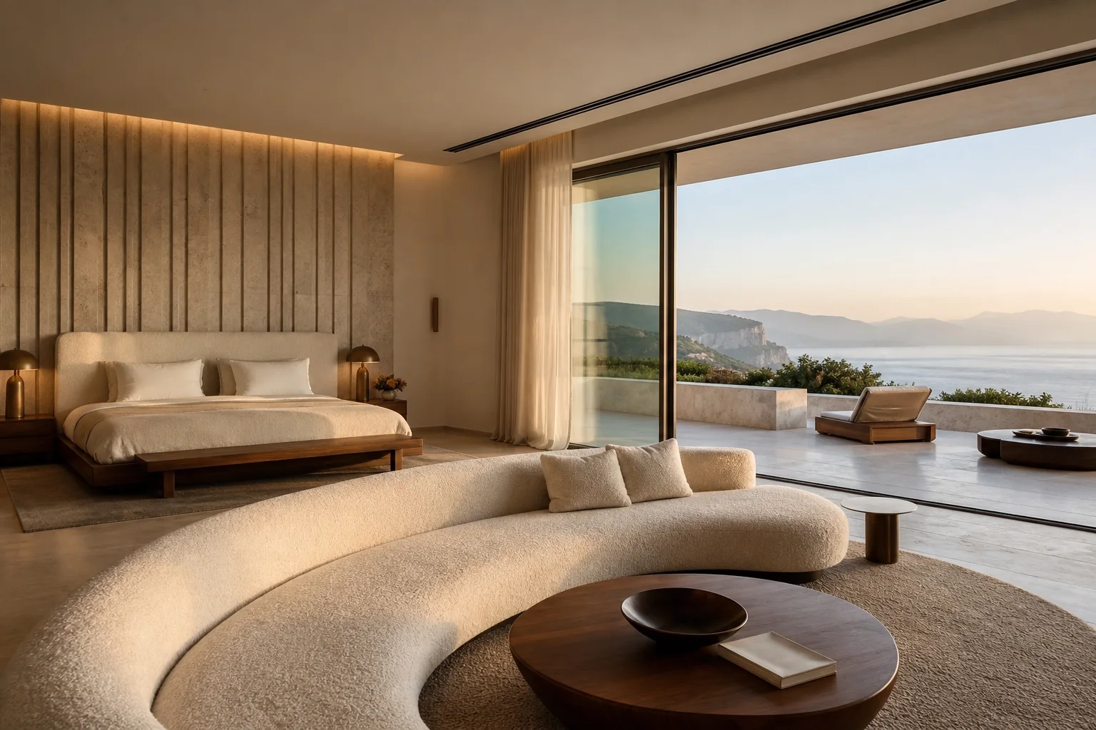
Midnight green, warm ivory, pale stone and restrained bronze establish continuity across every imagined setting.
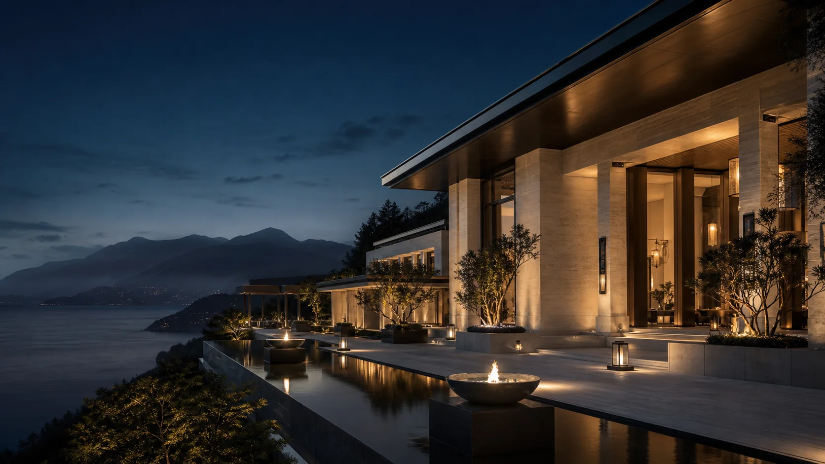
Large editorial typography and generous space create confidence. Photography focuses on architecture and atmosphere, deliberately avoiding logos, recognisable properties, crowds and conventional casino spectacle.
Interaction stays calm and legible. Motion is restrained, focus states are visible and the experience respects reduced-motion preferences. The result is premium because it is considered, not because it is excessive.